Welcome to the eSales project, where our aim was to improve the way clients find and access the services they need. Through research, including surveys and interviews, we gained insights into the challenges and frustrations clients face when searching for services like those offered by eSales. Join us as we delve into how we transformed the service discovery process, creating a more seamless and user-centered experience for eSales’ clients.
⏱️ Project Duration: 180 days
Team
Pedro Rocha: UX/UI Designer
Gabriel Appe: UX Researcher
Julia Fonseca: Project Manager
Eduardo Deos: UI Designer
My Role
As the UX/UI Designer on the eSales project, my role encompassed a range of activities, including conducting contextual inquiries and competitor analysis, creating personas, developing a sitemap, and designing wireframes and prototypes. I also played a key role in surveying users and conducting interviews to gather valuable insights for the project.
Tools Used
Figma
Photoshop
Illustrator
Google Slides
Google Forms
Challenge
The main challenge of the eSales project was to improve the organization of information, enabling users to easily understand the services provided by eSales. Based on valuable insights gathered, the goal was to enhance the clarity and accessibility of product offerings, ensuring a seamless user experience and facilitating informed decision-making.
Design Process
In this project, I followed a structured design process to ensure a user-centered approach and deliver effective solutions. By applying the principles of design thinking, I went through the following five stages:
Empathize
Through interviews and surveys, I gathered insights from users, understanding their needs, frustrations, and expectations regarding the eSales website.
Define
Based on the collected data, I identified key challenges, such as the complexity of the offered solutions and the need for clear and attractive presentation.
Ideate
During the ideation phase, I delved into the creative process of designing the eSales website. Two crucial elements that played a significant role in this phase were the development of a sitemap and the creation of wireframes.
Prototype
Using tools like Figma and Adobe Photoshop, I created interactive prototypes that showcased the proposed design improvements. This allowed for early testing and feedback from users, enabling refinement of the design.
Test
Through usability testing and feedback sessions, I validated the effectiveness of the design solutions. Iterative refinements were made based on the insights gained, ensuring a user-friendly and intuitive experience.
Findings on Interviews and Surveys
Based on 6 one-on-one interviews and 83 survey responses, we gained valuable insights into the needs and preferences of our target audience regarding logistics management within their company. Here are the key findings from our research:
0%
Advice-Seeking Behavior
The majority of participants (61.44%) indicated that they seek advice and guidance from industry experts and professional networks when it comes to managing logistics in their company.
0%
Research Frustrations
A significant number of respondents (43.37%) expressed frustrations in finding accurate and reliable information about logistics services. They highlighted the need for a streamlined and accessible platform to assist them in their research.
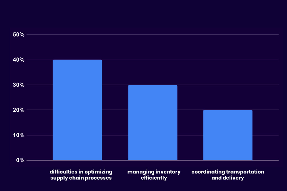
Challenges in Logistics Management
Participants highlighted several challenges they face, including difficulties in optimizing supply chain processes (40%), managing inventory efficiently (30%), and coordinating transportation and delivery (20%)
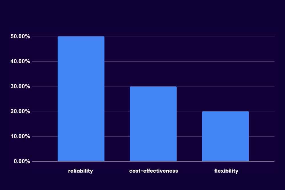
Shopping Behavior
When it comes to selecting logistics service providers, the participants indicated that they prioritize factors such as reliability (50%), cost-effectiveness (30%), and flexibility (20%) in their decision-making process.
Current Website
In order to evaluate the usability of the previous eSales website, we conducted a usability test with a sample of 10 participants. They were given four tasks to complete while interacting with the website.
Here are the tasks and key insights we gathered from the test
30%
Find the contact information for customer support
30% of participants struggled to locate the customer support contact information, resulting in frustration and increased time spent on the task.
Participants suggested that a prominent "Contact Us" button or a dedicated support page would improve accessibility.
60%
Explore the range of services offered by eSales.
60% of participants found it challenging to navigate through the services section of the website due to unclear categorization and lack of visual hierarchy.
Participants recommended organizing services into clear categories and providing concise descriptions for each service.
50%
Understand the difference between the services.
50% of participants found it challenging to distinguish the unique features and benefits of each service offered by eSales..
Participants expressed the need for clearer and more detailed descriptions that highlight the distinct value proposition of each service.
70%
Understand the data management service
70% of participants found it challenging to comprehend the data management service and its integrations on the website.
Participants expressed confusion regarding how the service works, what integrations are supported, and how it can benefit their business.
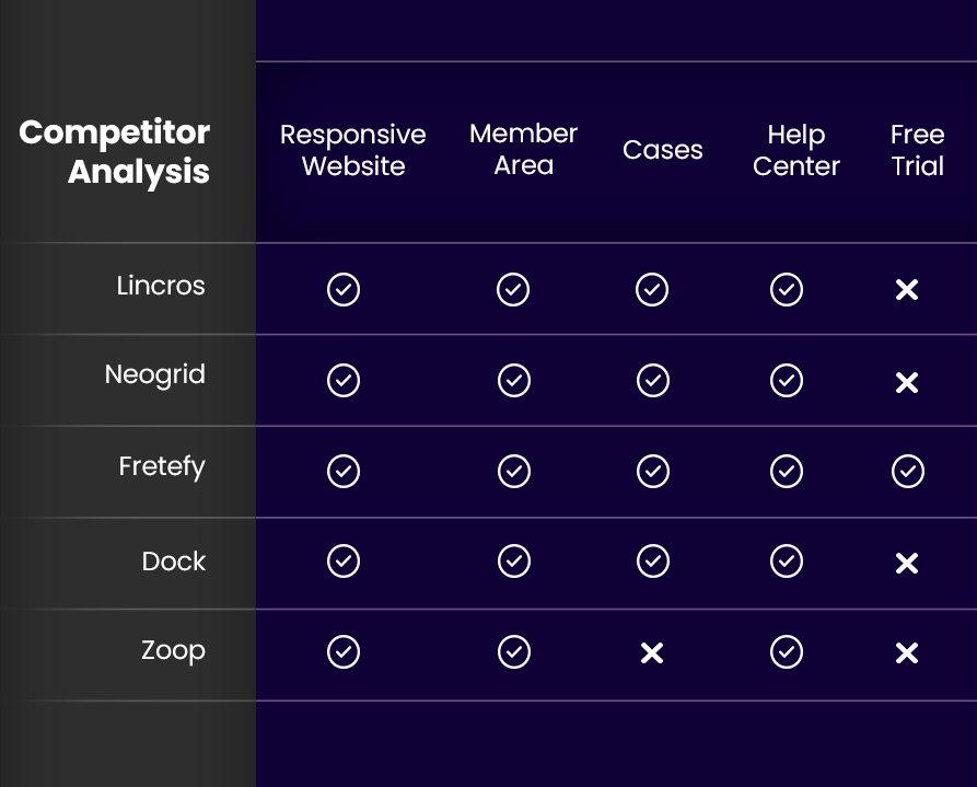
Competitor Analysis
As part of the eSales project, I conducted a competitor analysis, evaluating their websites and features. This benchmarking exercise helped identify industry trends and inform decision-making regarding the inclusion of key functionalities in the website.
In this table, each competitor is evaluated based on the following criteria:
Responsive Website: Indicates if the competitor’s website is responsive, meaning it adapts and provides a quality experience on mobile devices, tablets, and different screen sizes.
Member Area: Determines if the competitors have a dedicated member area where users can create accounts, log in, and access exclusive features or personalized information.
Cases: Evaluates whether the competitors showcase case studies or examples of previous projects, highlighting their clients and achieved results.
Free Trial: Indicates if the competitors offer a free trial period, allowing users to try out their services or products before making a purchase.
Help Center: Checks if the competitors provide a help center, which can be in the form of frequently asked questions (FAQ), documentation, tutorials, or online support to assist users.
Persona
👤 Name: Joana Silva
⌛ Age: 35 years
💻 Occupation: Procurement Manager at MediFarma pharmaceutical company
Joana is an experienced and dedicated professional with over 10 years of experience in the pharmaceutical industry. She is responsible for ensuring that MediFarma has the best suppliers and the best prices for the components and raw materials used in medication production. She is also accountable for ensuring that the company complies with all necessary regulations and standards. Joana is a highly organized and detail-oriented individual, and she strives to ensure that all her operations are carried out efficiently and effectively. She has an excellent relationship with her suppliers and is highly respected in the industry.
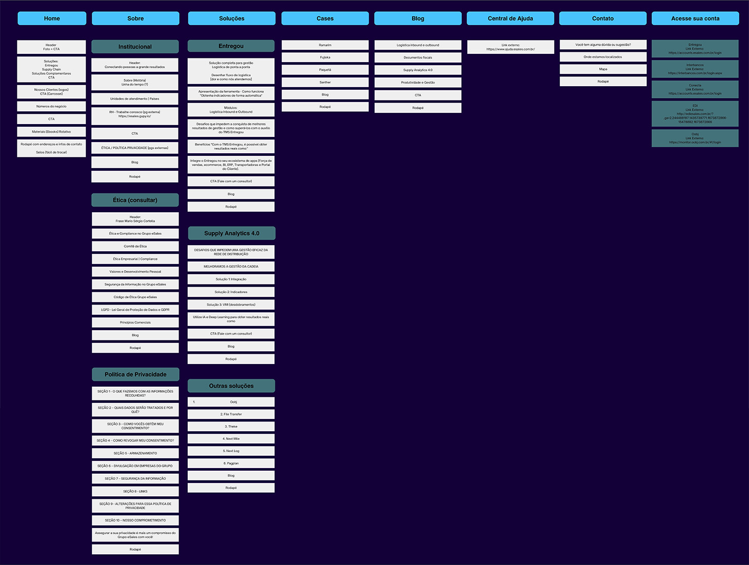
Sitemap
The sitemap section of the website provides a clear and organized overview of the site’s structure, showcasing the various pages, sections, and their hierarchical relationships. It helps users navigate and understand the content layout efficiently.
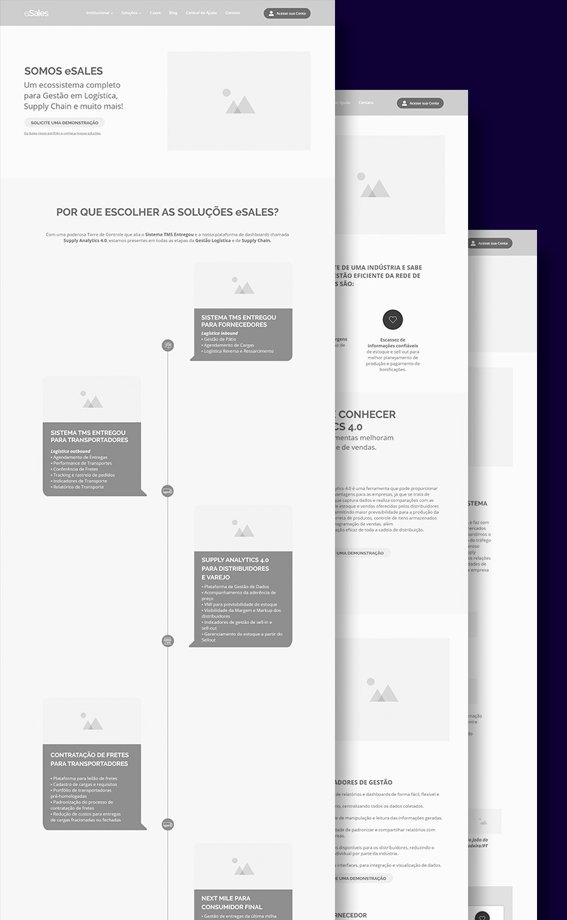
Wireframe
The Wireframe: A blueprint for the eSales project, showcasing the visual arrangement and functionality of the website. It defines the layout, navigation, and user interface elements.
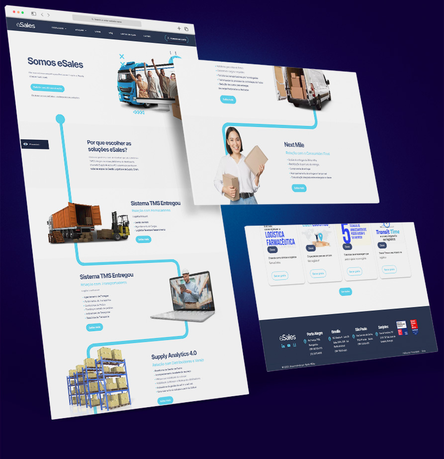
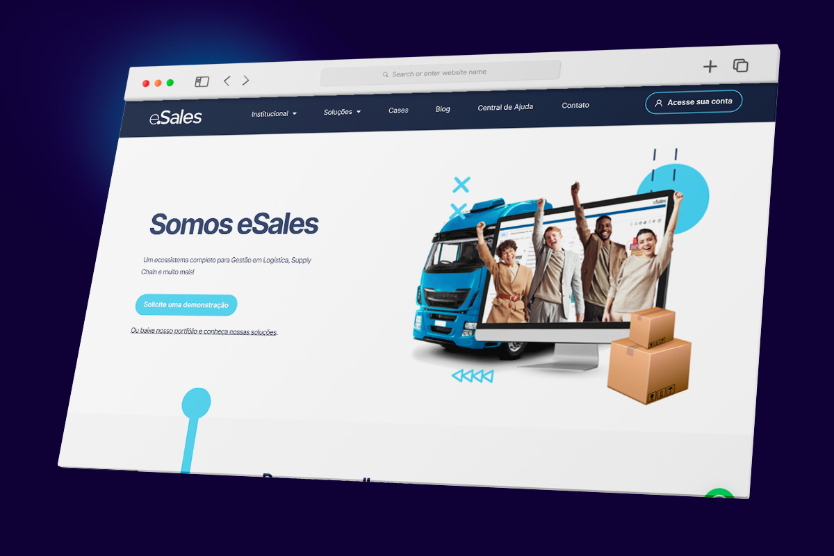
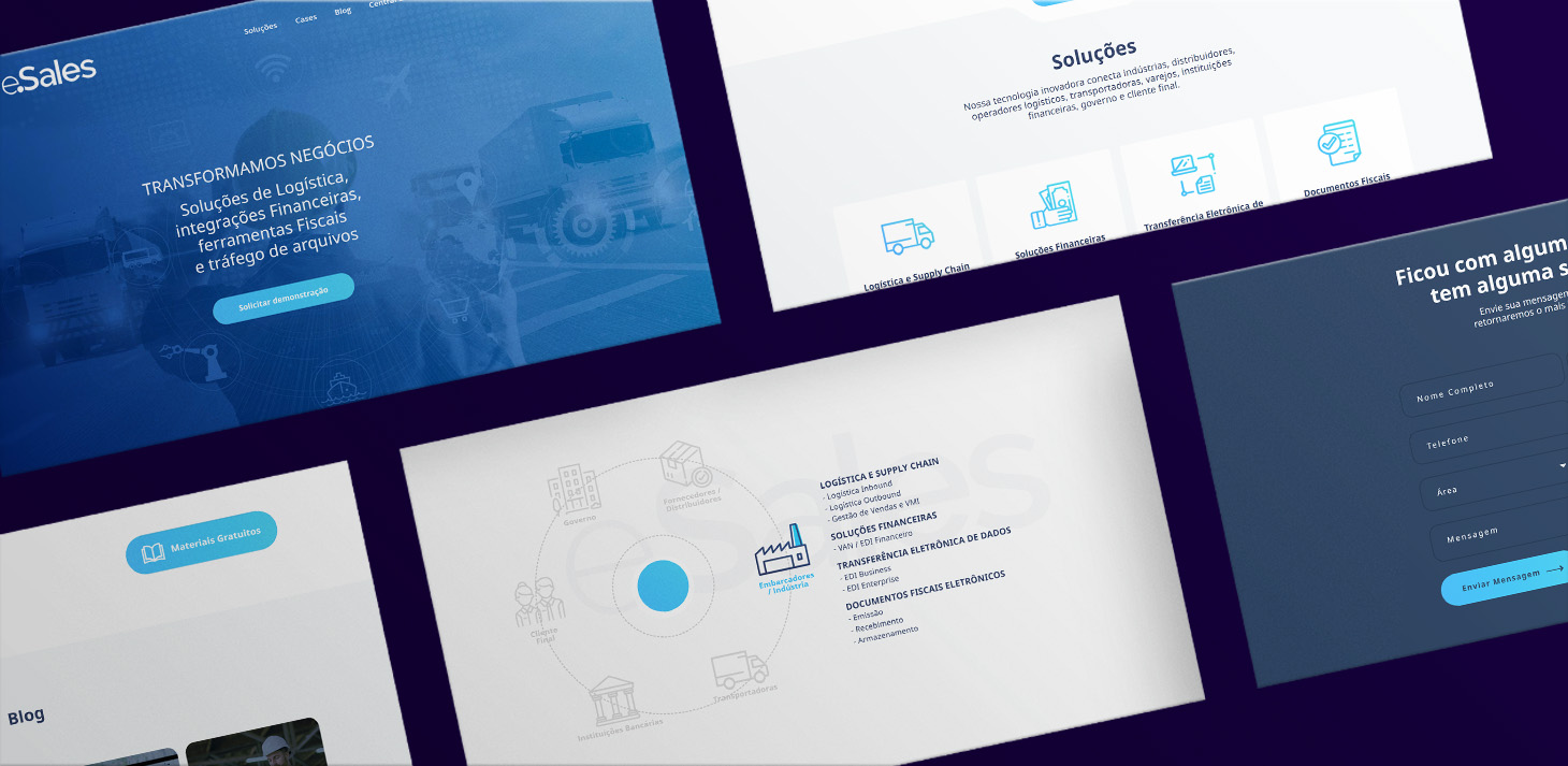
Prototype
The Prototype: A functional representation of the eSales website, bringing the wireframe to life. It allows users to interact with the interface, test navigation flows, and experience the intended features and functionalities before development, ensuring a user-centered design approach.